The Button widget helps you add a CTA button to your landing page. You can configure multiple actions for the button clicks.
For example, you can use this button:
- To redirect the clicks to:
- an external web URL, or
- another landing page, or
- an Email address.
- Open a pop-up window as a click action.
- To confirm an opt-in request and redirect to a thank you page.
- As a Call button (Clicks redirected to call the specified phone number).
- As an SMS button (Clicks redirected to send an SMS to the specified phone number).
- To download a file on the button click.
How to use a Button Widget in a Landing Page
Step 1
Navigate to the landing page builder
Use the Main Menu on the left to create a landing page and subsequently navigate to the landing page builder.
Step 2
Add a clickable Button to your landing page
The blank area on the left is the Workarea where you design your landing page, and the area on the right is the tools area where all the available design elements are displayed as widgets.
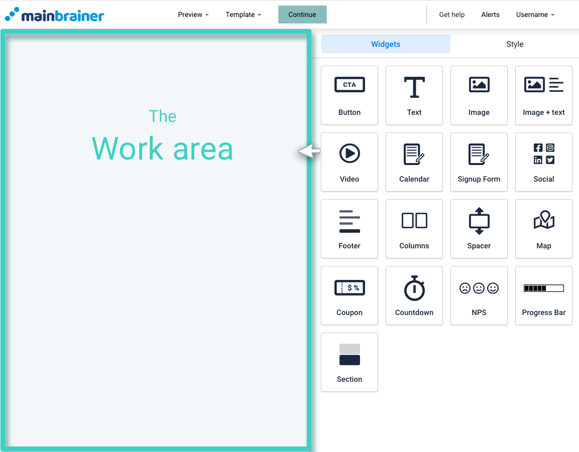
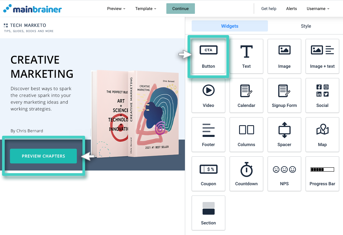
In order to add a clickable button to your landing page, drag and drop the Button widget to the work area (as highlighted in the screenshot below).
Step 3
Configure the click action for the Button
As you drop the button widget into the work area, the widget settings are displayed on the right (as highlighted in the screenshot below).
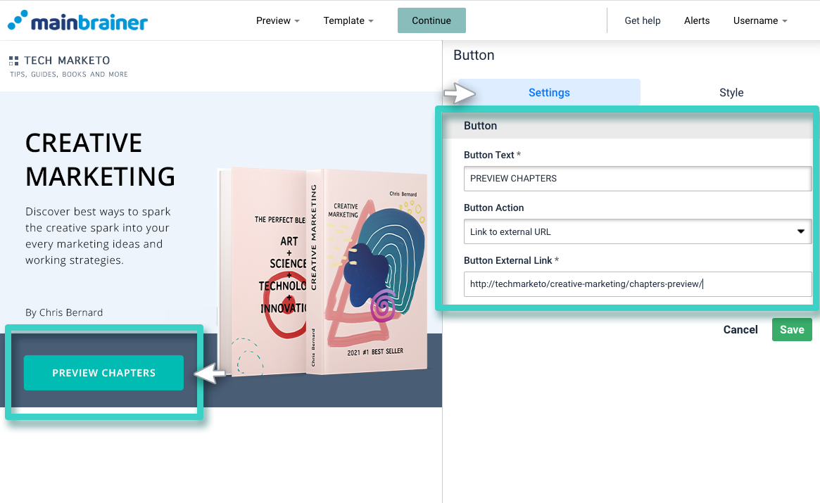
Herein, use the fields:
- Button text – to add/edit the text that appears on the clickable button.
- Button action – to specify the action that you want to trigger with the click of this button.
Based on the option you select in this field, the subsequent field gathers the required information relevant to that action.
Step 4
Style the Button Widget
You can edit the appearance of your button using the Style tab (as highlighted in the screenshot below).
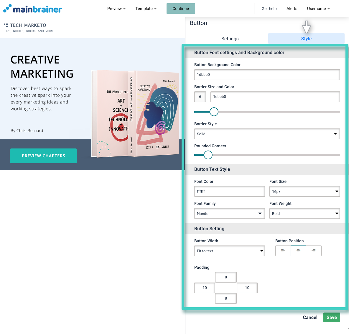
Herein, the different design options available are:
4.1 Button Font settings and Background color
- Button Background color to change the color of the button background
- Border size and color – to change the color of the button border (use the sizing bar to adjust the thickness of the border)
- Border Style to change the type of button border – solid, dotted, etc.,
- Rounded corners sizing bar to add rounded corners to the button.
4.2 Button text style
The different options available under this section help you edit the font style, color, font family, and font-weight of the button text.
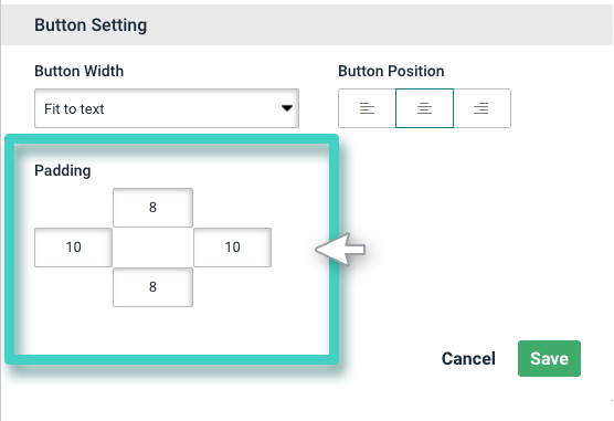
4.3 Button Setting
- Button width to adjust the width of the button
- Button Position to change the alignment of the button in the design
- Padding to enter in the desired padding measurements. Padding refers to the gap between the text entered in the button and the button boundary.
Click Save and that’s it!
You have successfully added a custom CTA button to your landing page!
Let’s proceed, and have a look at how to add text to a landing page using the Text Widget!
