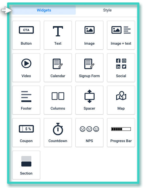
The landing page builder widgets offer you all the design elements you might need to create a landing page.
Let’s look at the different widgets available and the purpose they serve.
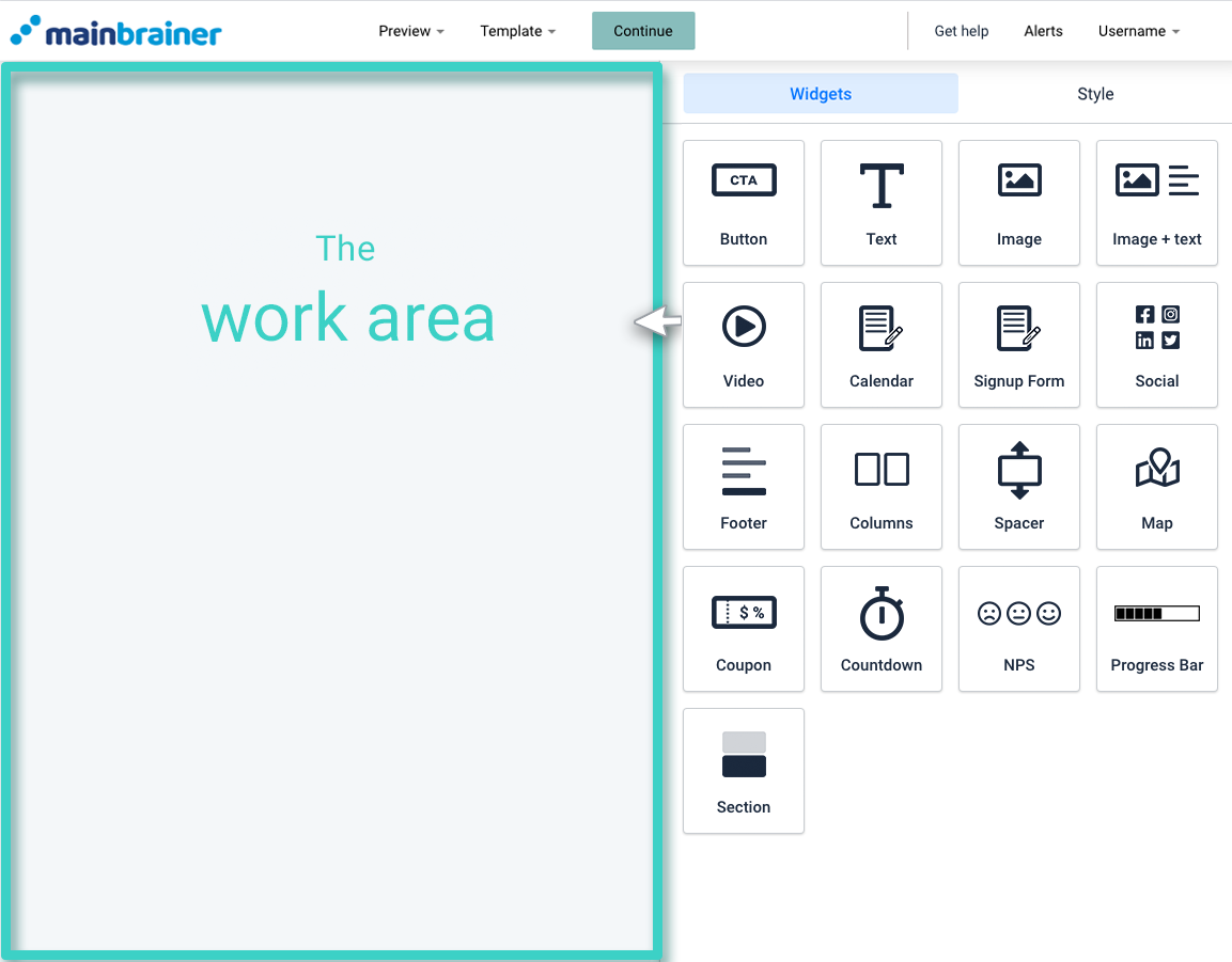
Before we proceed, Here’s a quick look at what our landing page builder looks like:

The area marked as the Work area is where you create your landing page. You can build your landing page by dragging and dropping the required widgets from the tools area into the Work area.

Let’s now look at the different widgets available and the design purpose they serve!
1. Button Widget
The Button widget is used for adding a clickable button to your landing page. You can configure various click actions for the button, such as redirecting the clicks to an external web URL, a landing page, or trigger a file download, etc.
2. Text Widget
As the name suggests, the Text widget helps you add text (including special characters and emoticons) to your landing page and format the text according to your design.
3. Image
The Image widget is used for adding images to your landing page. You can also hyperlink the image to an external web link.
4. Image + Text
The Image + Text widget is used for adding an image and text combination to your landing page. You can edit the text’s relative position with respect to the image according to your design requirements.
5. Video
The Video widget is used to add a video to your landing page. Currently, we support video addition via Youtube, Vimeo, and direct uploads.
6. Signup Form
The Signup Form widget is used to add a signup form to the landing page. The data captured via this signup form is auto-updated in the CRM in accordance with our platform’s data import rules.
7. Social
Use the Social widget to add social media profile links to your landing page. You can add links to your Facebook page, Instagram profile, Twitter handle, Youtube channel, and LinkedIn profiles using this widget.
8. Footer
An optimized footer section is a marker of a well-designed landing page. The Footer widget helps you add a well-designed and optimized footer section to your landing page.
9. Columns
The Columns widget is used to split the work area into columns. You have the option of splitting the workspace into 2,3, or 4 columns. Then, you can proceed to drag and drop any other widget onto the created columns.
10. Spacer
The Spacer widget is used for adding a negative space between two widgets. Negative space allows you to create focus areas in your marketing campaigns and make your campaigns easier to read and visually attractive.
11. Map
As the name suggests, the Map widget is used to add a map to your landing page. This widget can mark up to 5 addresses on the inserted map. You can use it to add roadmaps/satellite maps/terrain maps or hybrid maps.
12. Coupon
If you are planning to offer limited-time discounts to your customers, use the coupon widget to incorporate such offers into your landing page.
13. Countdown
The Countdown widget adds a countdown timer to your landing page which displays to your campaign recipients exactly how many days, hours, minutes, and seconds are remaining until a specific time and date.
14. Section
If you wish to add a horizontal design element to your landing page that merges with and transcends across the background space, use the Section widget to do so. This widget adds a uniform colored/transparent row on your landing page. You can then drag and drop the required widget onto this row.
